What signage did ArtSigns make for Porter Airlines?
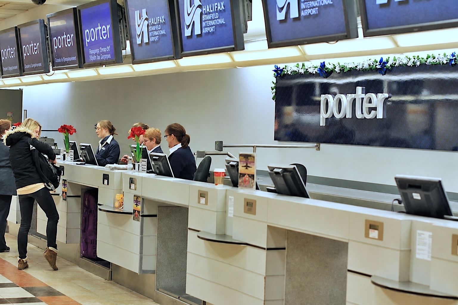
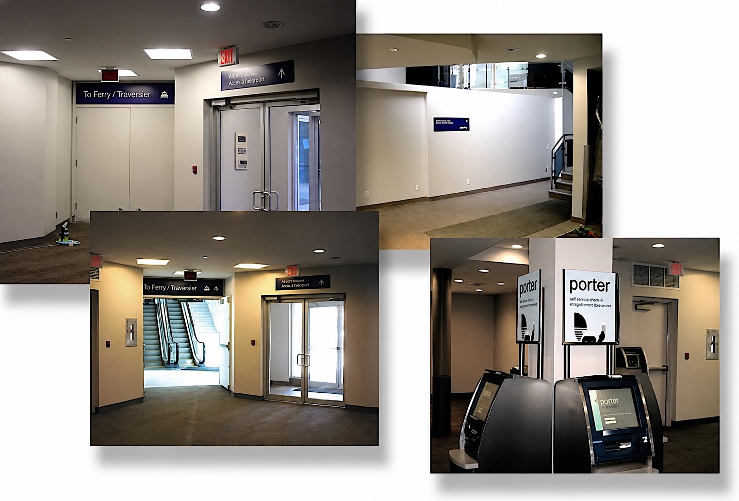
Two families. In 2006 we designed and built the complete bilingual wayfinding system for Porter’s Toronto ferry terminal and island terminal. Since then we have made the check-in counter signs, lobby signs and elevator graphics at Porter stations including Halifax, Montréal, Thunder Bay, Timmins, Windsor, Sault Ste. Marie and Burlington, Vermont.
How are the Porter check-in signs built?
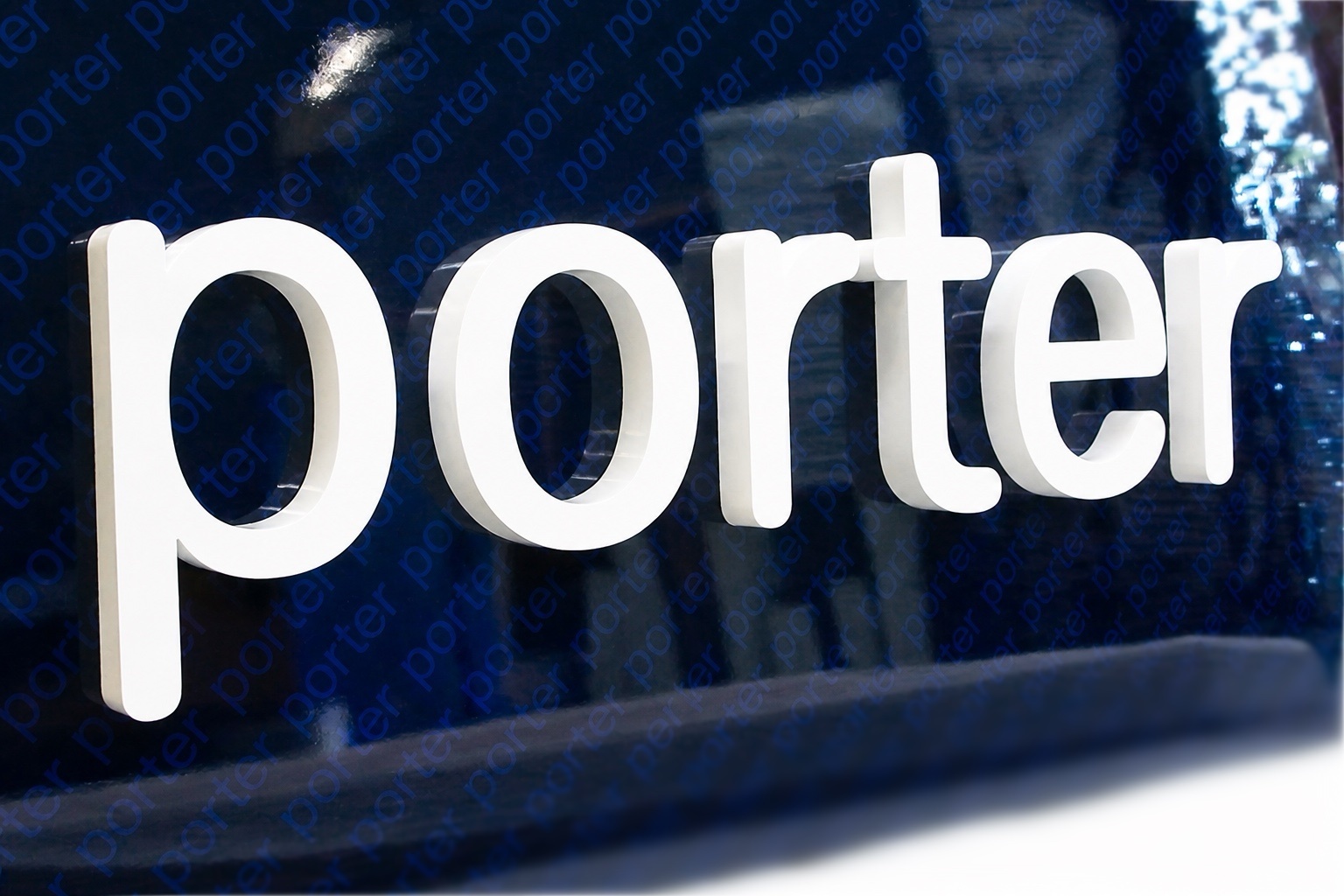
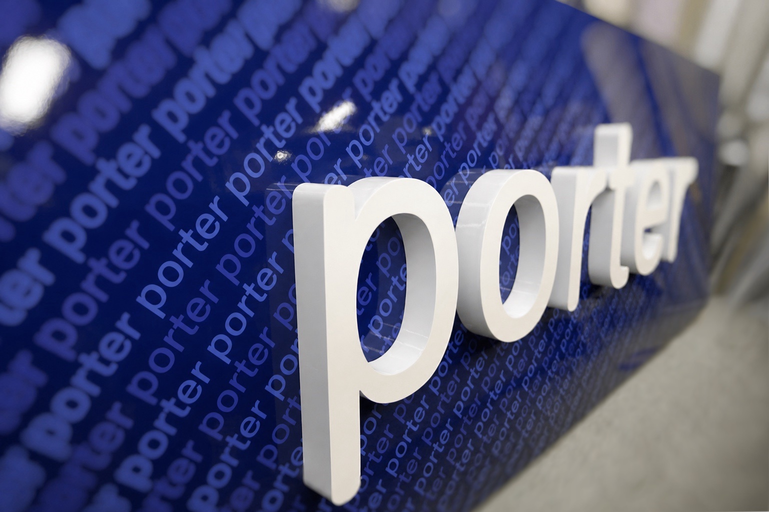
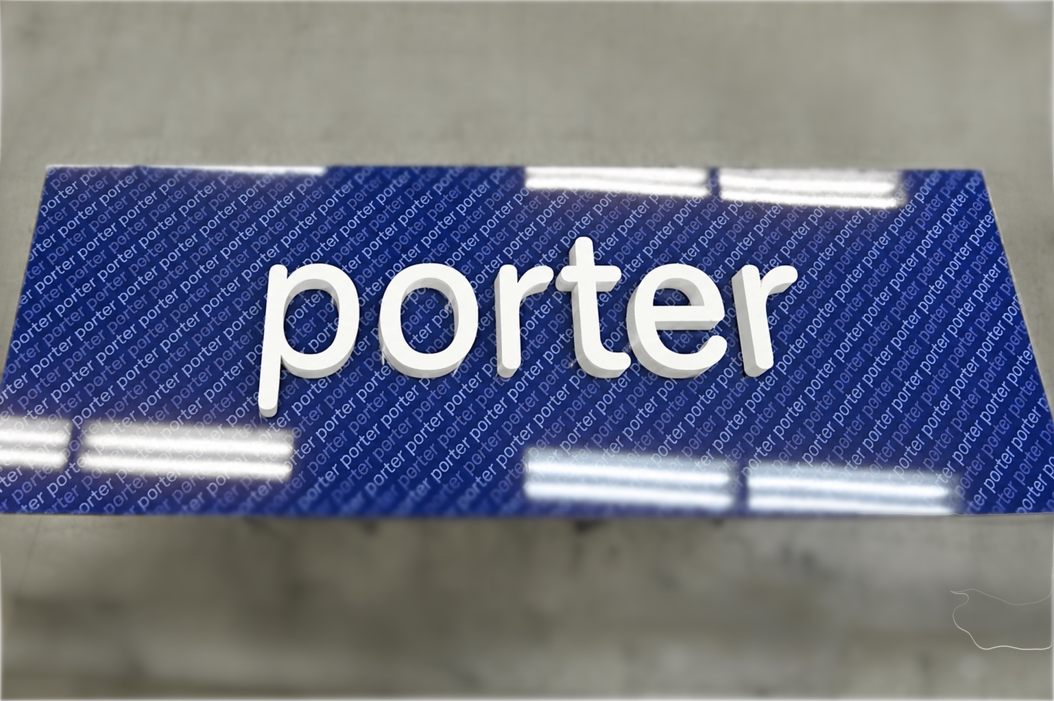
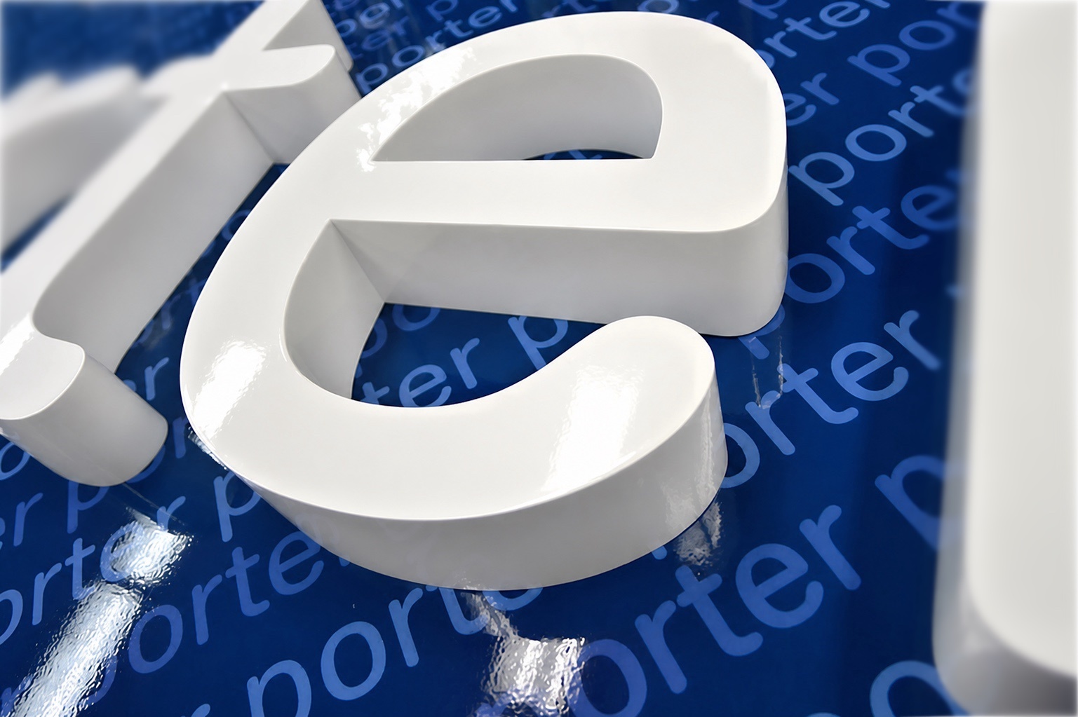
Formed aluminum channel letters, 2″ deep, painted automotive white, mounted on a 2″ background panel printed with the repeating “porter” pattern. Panel length varied from terminal to terminal, with 8′, 10′ and 12′ versions built. They were installed on the wall behind the check-in counters, beneath each city name.
How are the wayfinding signs built?
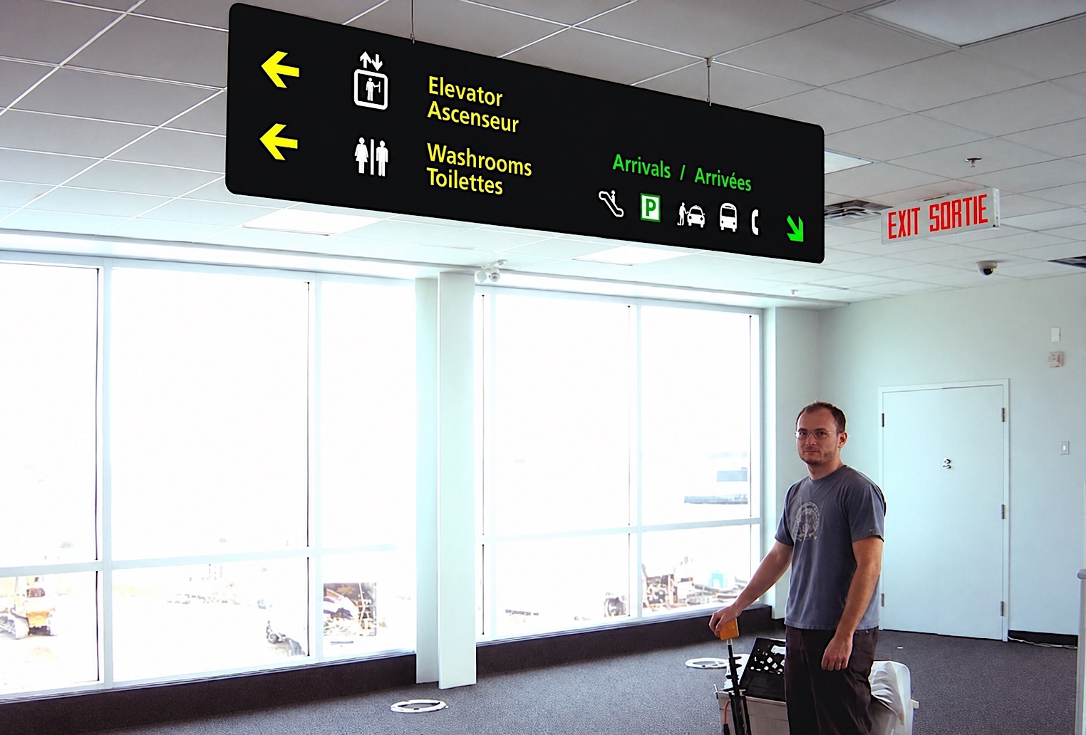
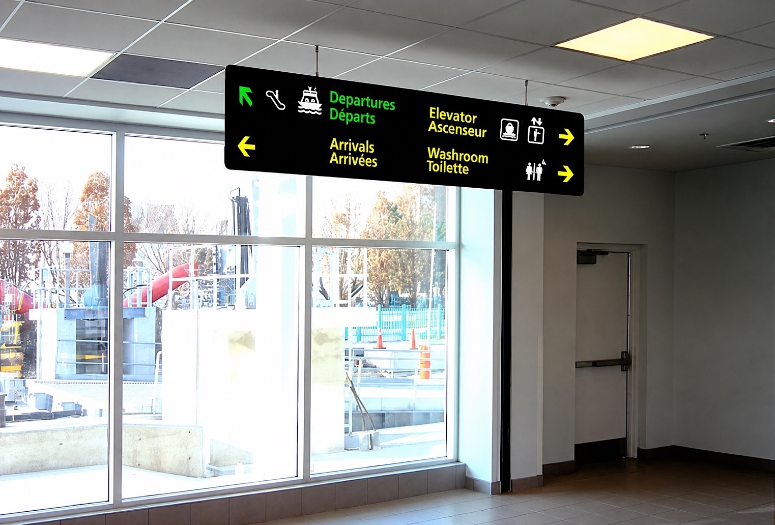
Aluminum background panels with ⅛” letters and pictograms raised off the face. Some are fixed flat to the wall; overhead signs are suspended from the ceiling on a stainless steel rod system so they can be read at a distance.
Why is the Porter wayfinding bilingual?
Every directional sign carries English and French: departures, arrivals, ferry, elevators, washrooms, exits. Porter is a Canadian airline operating from Toronto, so the system had to serve both languages from day one.
When was the Porter terminal wayfinding installed?
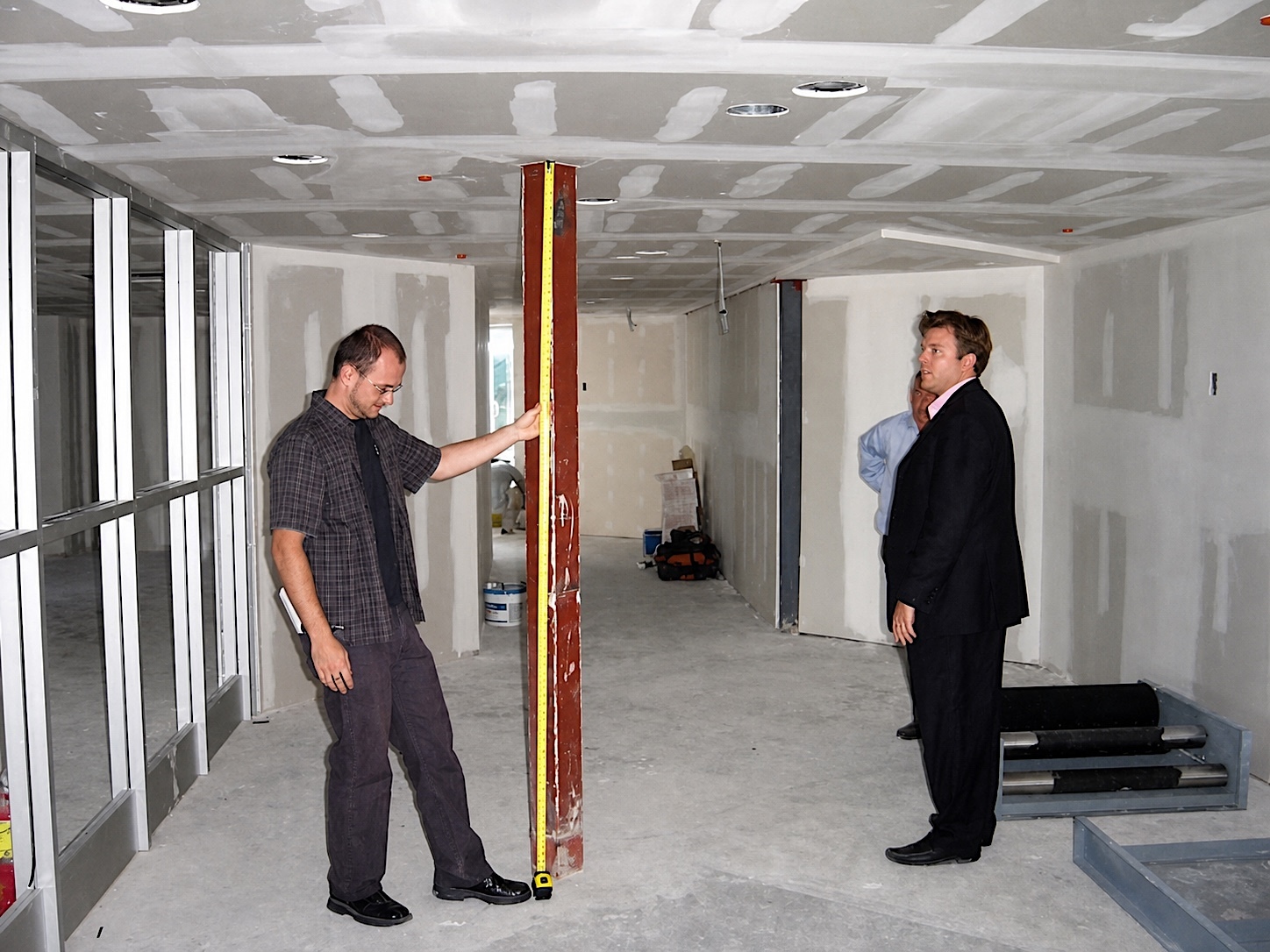
In 2006, ahead of Porter’s first flight on October 23, 2006. The system was measured and specified while the terminal interiors were still under construction, and it was in place before the doors opened.
Who at Porter did ArtSigns work with?
Michael Deluce, who was with Porter from the 2006 launch and is now the airline’s President and CEO. He worked directly with us on the sign families, materials and finishes.
Can ArtSigns design wayfinding for airports and transit terminals outside Toronto?
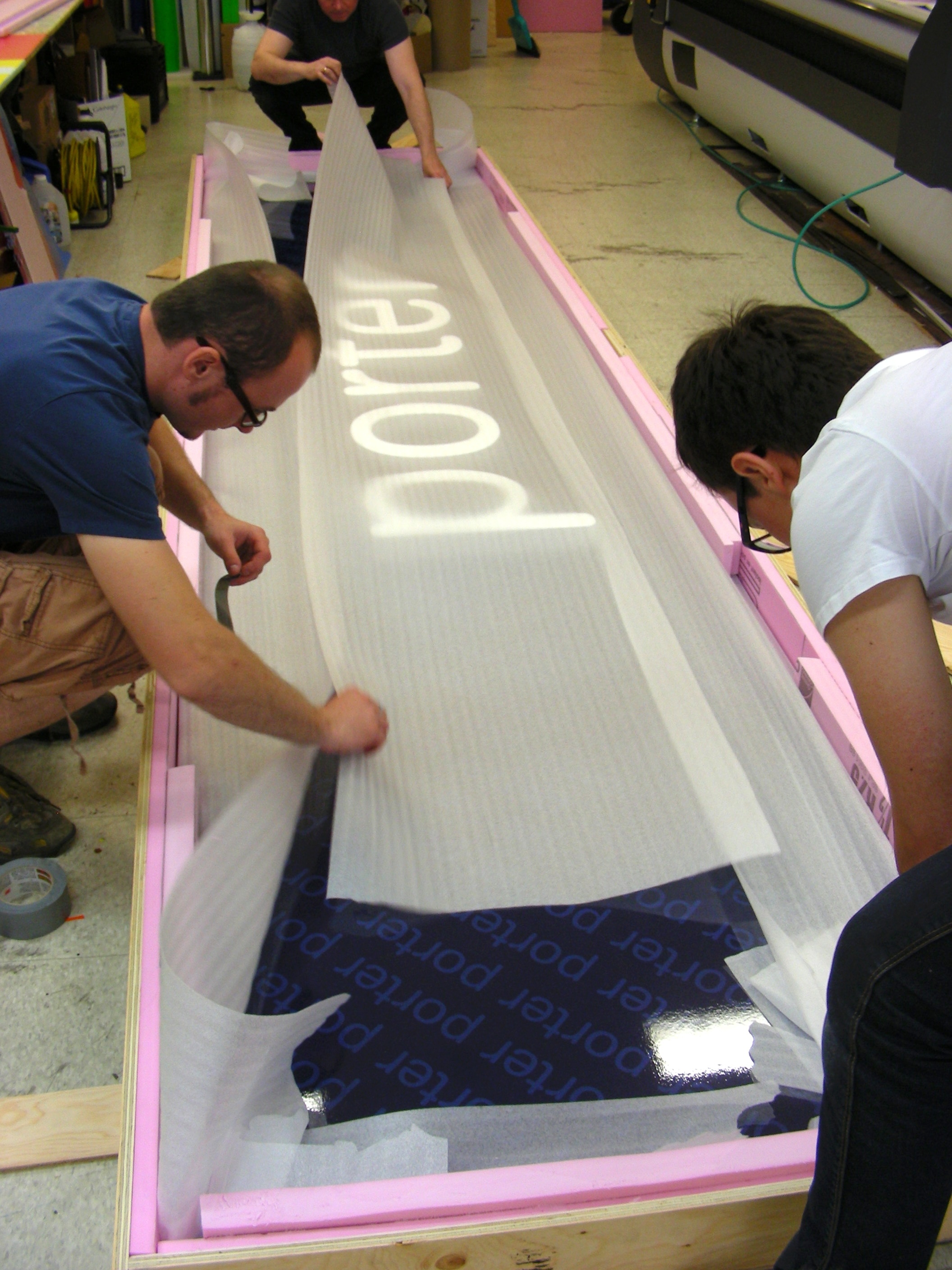
Yes. We design and manufacture custom airport and transit wayfinding for terminals across the USA and Canada, and we ship finished panels crated and foam-wrapped, as we did for Porter’s Halifax station.